devblog
The PixelGrid
christian � May 25, 2019
The PixelGrid

For the less technically savvy of you:
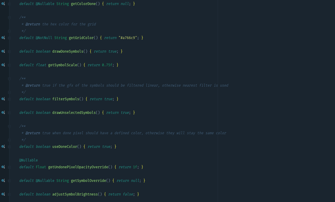
What you can see here is the beginning of completely new possibilities for me. Even if it's only a few lines - what you see is a so called Interface and in this context it will open new ways for us to handle new functions in PixelGrid!
Let me explain a bit, maybe you'll find these changes in the code just as exciting as I do.
How it was so far
Since the App exists, PixelGrid's appearance has been very limited in its presentation form. Everyone knows it in this way:
There were some points that I haven't liked so much till today. I summarized them in the following picture:
There are a few other points that do not fit into the picture.
- Grid color can't be adjusted
- The icon size is unchangeable relative to the pixel
- I can't decide when the icons are displayed and when not.
- It's not possible to display the color or appearance of ticked-off stitches differently from the appearance of unmade stitches.
Adjustments were a step in the right direction
With the Beads version (which also includes a form of the PixelGrid) I have adapted a lot in the source code, which has led me further in the desired direction.
Which settings were made possible for us as a result?
These were the first changes that allowed us to reach a whole new clientele: All who like to lay iron beads, some also like to use Beads for painting or embroidery.
What has unfortunately not changed
Some points remained untouched and were not flexible enough for what we intend to do with PixelGrid in the future.
I'm afraid after the adjustments it was still:
- Relatively slow
- Hardly adjustable
- Optimized for a few special cases
Our challenge
We want to create a PixelGrid that leaves nothing to be desired in its operation. And I have started to revisit this long untouched topic.
Why am I not making more use of the fact that I come from the game developer scene?
I don't have to ask myself this question any longer and the PixelGrid will use the power of the graphics cards even more in the upcoming versions, which by now every mobile phone has installed by default.
The exact technique I won't explain here, a lot of time has been devoted to it and I don't think that it should be of great interest anyway ;-)
Finally, it doesn't matter how many icons are displayed on the screen at the same time (you can see them very small :-P ):
But more importantly:
I can finally make many settings that were not possible before.
Finally I can
- Determine when icons are displayed
- Which icons are displayed
- How not ticked-off pixels are displayed
- In which color the icons are displayed
- Whether and which color ticked-off pixels have
- What transparency or visibility colors have
- etc.
And all this at a rapid speed without stuttering. I'm so happy to be able to show you the changes soon.
I hope you are already as excited as I am to hold the next version in your hands. I'll leave you a little teaser here for what's coming soon.
I wish you a great weekend!
See you in our Facebook group ;-)
your Christian
